

If you open Elementor today and start building a page, you will notice something different from the old tutorials on YouTube. Instead of adding a section, choosing columns, and dropping widgets inside, Elementor now asks you to add a container. This change confused a lot of beginners, and for good reason: thousands of older guides still teach the section system, while Elementor itself has moved on to containers. In this guide you will learn what sections and containers actually are, how they differ, which one you should use in 2026, and how to switch without breaking your existing pages.
What Were Sections and Columns in Elementor?
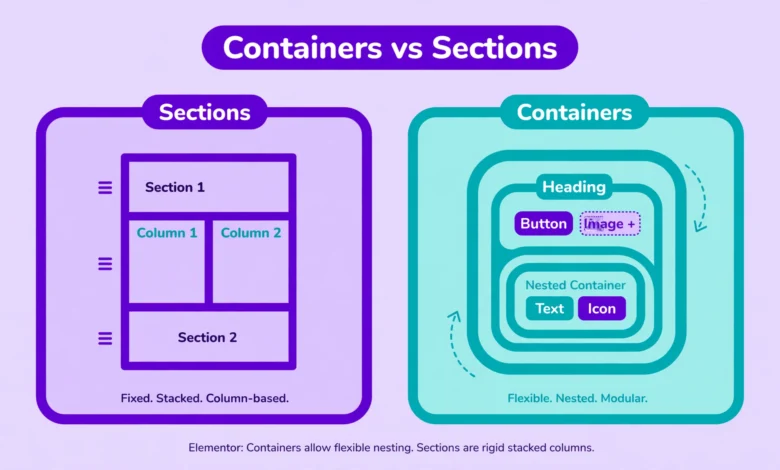
For most of Elementor history, every page was built from sections. A section was a full width horizontal band, and inside it you placed columns, which divided the band into vertical slices. Your widgets, headings, images, buttons, and everything else, lived inside those columns. If you wanted two columns side by side, you added a section, set it to two columns, and put one widget in each.
This system was simple to learn, and it is what almost every Elementor tutorial from 2023 and earlier teaches. But it had real limitations. Want a more complex layout? You had to add an inner section inside a column, which created deep layers of nested div elements in your page code. Those extra layers made pages heavier and slower, and making everything behave on mobile often required fiddly custom CSS or duplicate hidden sections for different devices.
Elementor has not removed sections, and your old pages built with them still work fine. But sections are now considered the legacy layout system, and Elementor no longer develops new features for them.
What Are Flexbox Containers in Elementor?
Containers are Elementor modern layout system, introduced as an experiment in 2022 and made the default in 2023. Instead of the rigid section, column, inner section structure, you get a single flexible box. You drop widgets directly into the container, and you control how they arrange themselves with direction, alignment, and gap settings.
The technology behind containers is CSS Flexbox, the same layout engine professional web developers use. That is why containers feel so much more powerful: you can stack items vertically or horizontally, center them with one click, space them evenly with a gap setting, wrap them onto new lines on small screens, and nest containers inside containers as deep as you like, all without touching code.
A practical example: a row of four feature boxes. With sections, that meant one section, four columns, and one widget in each column, plus manual padding to create space between them. With containers, you add one container, drop in four widgets, set the direction to horizontal, and set a gap of 20 pixels. The spacing is automatic and consistent, and on mobile you can switch the direction to vertical with a single setting.
Containers vs Sections: The Key Differences
Here is a side by side comparison of the two systems:
- Structure. Sections need the section, column, and sometimes inner section layers. Containers hold widgets directly, which produces cleaner page code.
- Performance. Fewer nested elements mean a smaller DOM, which translates to faster rendering. Container based pages consistently score better on speed tests than equivalent section based pages.
- Alignment. Sections offered limited alignment control. Containers give you full control over horizontal and vertical alignment, justify options, and element order.
- Spacing. Sections relied on manual padding and margins between columns. Containers have a single gap setting that spaces all items evenly.
- Nesting. Sections allowed only one inner section per column. Containers can be nested infinitely, which makes complex layouts like cards inside grids much easier.
- Responsiveness. Sections often needed extra tweaks or duplicated content for mobile. Containers adapt naturally: change the direction, wrap behavior, or gap per device in the responsive settings.
- Future support. All new Elementor layout features are built for containers. Sections receive only maintenance.
Which Should You Use in 2026?
The short answer: use containers for everything new. Every page, template, and popup you build from now on should use containers. They are faster, more flexible, and they are where all future Elementor development is going.
The longer answer has one exception. If you have an existing site built entirely with sections and it works well, there is no emergency to rebuild it. Sections still render correctly, and Elementor has not announced any plan to remove them. Rebuilding a large working site just to switch layout systems is rarely worth the effort and the risk of introducing new bugs.
A sensible middle path: build all new pages with containers, and convert old section based pages to containers only when you are already redesigning them. If you are following our guide on editing the header in Elementor free, note that headers and footers built with containers behave the same way and get the same speed benefits.
How to Enable and Switch to Containers
On fresh Elementor installations, containers are already the default. If your site was set up a while ago, check the setting:
- Go to Elementor, then Settings in your WordPress dashboard.
- Open the Features tab.
- Find Flexbox Container and set it to Active.
- Save your changes.
After activation, the plus button in the Elementor editor offers containers instead of sections. Your existing section based content is untouched. The two systems can coexist on the same site, even on the same page, which makes gradual migration completely safe.
Elementor also provides a conversion tool. When you select a section in the editor, you can right click it and choose the convert option to turn it into a container. Always test converted pages carefully afterward, because complex section layouts sometimes need small spacing adjustments after conversion. Convert on a staging copy first if the page matters.
Practical Container Tips for Beginners
Containers unlock a lot of power, but a few habits will keep your layouts clean:
- Use the gap setting instead of margins. Margins on individual widgets create uneven spacing that breaks when you reorder items. The container gap setting keeps spacing consistent automatically.
- Set direction per device. A horizontal row of cards on desktop can become a vertical stack on mobile with one responsive setting. Check the tablet and mobile views of every container you build.
- Do not over nest. Infinite nesting is a feature, not a requirement. Three levels deep is plenty for almost any design. Deeper nesting makes pages harder to edit later.
- Use the Navigator panel. With containers, the page structure is flatter but can still get busy. The Navigator (press Cmd or Ctrl plus I) shows your container tree and makes selecting the right layer much easier.
- Learn the difference between flexbox and grid. Elementor containers support both. Flexbox arranges items in a row or column, while grid creates true two dimensional layouts. Grid is the better choice for image galleries and card grids.
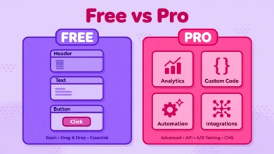
One more thing beginners ask about: performance. Containers genuinely help, but they are not magic. A container based page with twenty heavy widgets and unoptimized images will still be slow. If speed is your concern, read our guide on why WordPress sites get slow alongside this one, because layout is only one piece of the puzzle. And if you are weighing the free and paid versions while rebuilding, our Elementor Free vs Pro comparison covers which container features need the Pro version.
Frequently Asked Questions
Do Elementor containers work with the free version?
Yes. Flexbox containers are available in Elementor free. You get direction, alignment, gap, wrapping, and nesting without paying anything. Some advanced container features, like custom queries in loop grids, are Pro only, but the core container system is fully free.
Will my old section based pages break?
No. Activating containers does not change or damage existing section based content. Old pages keep rendering exactly as before, and you can keep editing them with sections. The two systems coexist, so you can migrate gradually or not at all.
Are containers actually faster than sections?
Yes, measurably. Because containers produce fewer nested div elements, the browser has less work to do when rendering the page. The difference is small on simple pages and significant on complex ones. Combined with image optimization and good caching, containers are part of a genuinely faster Elementor site.
Should I convert all my old sections to containers?
Only when you are redesigning those pages anyway. Bulk converting a working site risks subtle layout changes that take time to fix, and the speed gain alone rarely justifies the effort. A better rule: new pages get containers, old pages get converted when they get a redesign.
Last updated: October 2026.