A page that looks perfect on a laptop can fall apart on a phone. Headings overflow the screen, columns squeeze into narrow strips, buttons sit too close together, and images push text off the edge. Most of your visitors now arrive on mobile, so a page that only works on desktop loses readers and customers every day.
Elementor solves this with responsive settings built into every widget, section, and container. You can preview your page on tablet and mobile inside the editor, change font sizes and spacing for one device only, hide elements that do not belong on a small screen, and reverse the order of columns on mobile. This guide explains each setting, how the breakpoints work, and the order in which to make your changes so nothing breaks.
What Is Responsive Mode in Elementor?
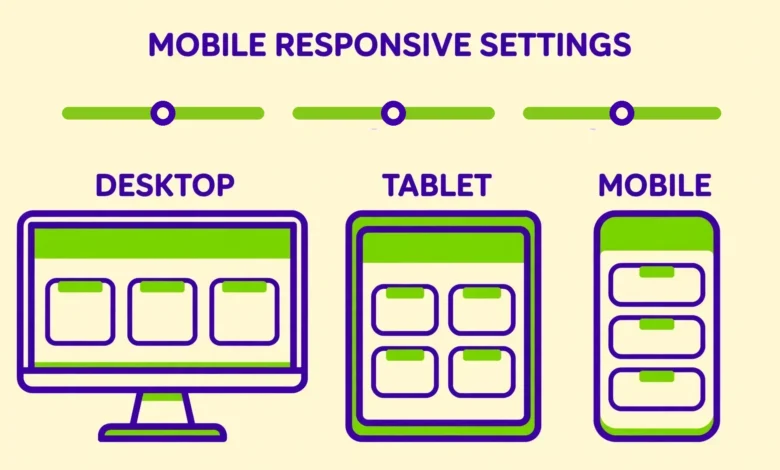
Responsive mode is the device preview switch at the bottom of the Elementor editor panel. It lets you see your page exactly as it will look on desktop, tablet, and mobile without leaving the editor. Click the monitor icon for desktop, the tablet icon for tablet, or the phone icon for mobile. The canvas resizes to match the device width, and every change you make while a device is selected applies to that device and the devices below it.
That last detail matters more than anything else in this guide. Elementor settings inherit from larger screens to smaller screens, never the other way around. A change you make on desktop flows down to tablet and mobile automatically. A change you make on mobile affects mobile only. This one rule explains most responsive surprises: if your mobile heading looks wrong, you probably set its size on desktop and never overrode it for mobile. To see responsive mode in a real layout, try it on a page built with our guide to add an image gallery in Elementor free.
What Are the Elementor Breakpoints?
A breakpoint is the screen width where Elementor switches from one device layout to another. Elementor uses two breakpoints by default, which divide screens into three device ranges. Desktop covers screens wider than 1024 pixels. Tablet covers screens from 768 to 1024 pixels. Mobile covers screens 767 pixels wide and below. Most phones fall in the mobile range, most tablets fall in the tablet range, and laptops and desktop monitors fall in the desktop range.
You can change these values under Elementor, then Settings, then Style, or under Site Settings, then Breakpoints, in newer versions. The defaults work well for most sites, and changing them is rarely necessary. A breakpoint change affects the whole site at once, so check every page afterwards. Keep the defaults unless you have a clear reason to change them.
How Does Inheritance Work From Larger to Smaller Screens?
Inheritance is the rule that a setting flows down from desktop to tablet to mobile until you override it. Set a heading to 48 pixels on desktop, and it stays 48 pixels on tablet and mobile unless you change it there. Change it to 36 pixels on tablet, and mobile still shows 36 pixels, because mobile inherits the tablet value. Change it to 28 pixels on mobile, and only mobile changes.
The practical workflow follows directly from this rule. Always design the desktop version first and finish it completely before touching tablet or mobile. Then switch to tablet, fix only what looks wrong, and leave everything else alone. Then switch to mobile and do the same. If you start on mobile and work upward, your mobile changes will never reach desktop. The editor shows a small device icon next to any value you have overridden, so you can spot device specific settings at a glance. Click that icon to reset an override and fall back to the inherited value.
How to Set Device Specific Typography and Spacing
Typography is the first thing to fix on mobile, because desktop font sizes are almost always too large for a phone screen. A 48 pixel heading that looks bold on a laptop will wrap across four lines on a phone. Select the heading widget, switch to mobile view, open the Style tab, and set a smaller size. The same idea applies to line height and letter spacing, which you can also tune per device.
- Switch to mobile view using the phone icon at the bottom of the editor panel.
- Select the heading or text widget you want to adjust.
- Open the Style tab and set a smaller font size, such as 28 pixels for a main heading.
- Adjust the line height if the lines feel cramped or too far apart at the new size.
- Switch to tablet view and set a middle size, such as 36 pixels, if the desktop size still looks too large there.
- Check the desktop view afterwards to confirm nothing changed there.
Spacing works the same way. Padding and margins have a small device switch next to them, so you can set different values per device. A section with 80 pixels of top padding on desktop often needs only 40 pixels on mobile. Columns that sit side by side on desktop usually need a gap between them when they stack on mobile, so add bottom margin in mobile view. Our guide to Elementor containers vs sections explains how the newer container layout handles spacing and gaps.
How to Hide an Element on Mobile, Tablet, or Desktop
Some elements simply do not belong on a small screen. A wide decorative image, a long desktop only menu, or a sidebar full of widgets can all be hidden on mobile while staying visible on desktop. Elementor puts this control in the Advanced tab of every widget, section, and container, under the Responsive section. You will see three toggles: Hide on Desktop, Hide on Tablet, and Hide on Mobile. Turn on the one you need.
Hiding is also useful for showing a different version of the same content per device. A common pattern is a short heading for mobile and a longer heading for desktop. Create both headings, hide the long one on mobile, and hide the short one on desktop and tablet. Use this pattern sparingly, though, because hidden elements still load in the page code, so hiding heavy widgets on mobile will not make the page faster. If speed is the goal, our guide to speed up an Elementor website covers the fixes that actually reduce load time.
How to Reverse Columns on Mobile
When a two column section stacks on mobile, the left column appears first and the right column appears below it. That order is often wrong. A typical hero section has text on the left and an image on the right. On mobile, the image should usually come first to catch the eye, with the text below it. Elementor lets you flip this order without rebuilding the section.
- Select the section or container that holds the two columns.
- Switch to mobile view in the editor.
- Open the Layout settings for the section or container.
- Turn on Reverse Columns, sometimes labelled Reverse Order, for the mobile device.
- Check that the image now appears above the text on the mobile preview.
- Switch back to desktop view and confirm the desktop order is unchanged.
Reverse Columns only affects the device you set it on, so turning it on in mobile view leaves the desktop layout untouched. The same control exists for tablet view, which is useful when a three column layout collapses to two columns on a tablet and the order feels wrong there too. Test the result on a real phone after publishing. If you use a sticky header, check it on mobile as well, because a header that works on desktop can cover too much of a small screen. Our guide to a sticky header in Elementor free includes mobile specific header tips.
How to Regenerate CSS After Changing Responsive Settings
Elementor stores the styles for your pages in CSS files that it generates and caches. Sometimes, after changing responsive settings, the live page still shows the old layout even though the editor preview looks correct. The cause is almost always a stale CSS file. Elementor has a built in tool to fix this.
- Go to Elementor, then Tools, in the WordPress dashboard.
- Click Regenerate Files under the General tab.
- Wait for the confirmation message that the files were regenerated.
- Clear your caching plugin cache, if you use one, and clear your browser cache.
- Reload the live page on a phone or in a private browser window to confirm the new layout.
Make regenerating CSS a habit after any batch of responsive changes, especially after editing breakpoints or hiding elements. The official Elementor help center at elementor.com/help documents this tool and the other options on the Tools page. If regenerating does not fix the layout, check whether a caching plugin or your host cache is serving an old copy of the page, as our web hosting guide explains.
Common Mobile Layout Problems and Their Fixes
The most common mobile problem is horizontal scrolling, where the page is wider than the phone screen and visitors can swipe sideways into empty space. This is almost always caused by one element that is too wide: a large image, a heading with a long unbroken word, or a section with negative margin. Switch to mobile view, find the element that sticks out past the right edge, and reduce its width or font size until the scrolling stops.
- Horizontal scrolling: find the element wider than the screen and reduce its width, font size, or negative margin.
- Text overflowing its container: lower the font size on mobile or shorten the heading.
- Buttons too close together: add bottom margin to stacked buttons in mobile view so thumbs can tap them separately.
- Columns not stacking: check the section layout, because a fixed column width can prevent stacking on mobile.
- Images too small or too large: set the image size per device, and use a smaller image on mobile to save load time.
- Video overflowing the screen: set the video widget width to 100 percent in mobile view.
Before you decide whether Elementor Pro is worth it for responsive features, read our Elementor free vs Pro comparison. The free version already includes responsive mode, breakpoints, device specific typography, hiding elements, and reverse columns, so most mobile fixes need no upgrade at all.
Frequently Asked Questions
What are the default breakpoints in Elementor?
Elementor uses two breakpoints by default. Desktop covers screens wider than 1024 pixels, tablet covers 768 to 1024 pixels, and mobile covers 767 pixels and below. You can change these values under Elementor Settings or Site Settings, but the defaults work well for most sites.
Why does a change I make on mobile not show on desktop?
Elementor settings inherit from larger screens to smaller screens, never upward. A change made in mobile view affects mobile only, and a change made on tablet affects tablet and mobile. This is by design, so you can tune small screens without touching the desktop layout. If you want a change everywhere, make it in desktop view.
How do I hide a section on mobile in Elementor?
Select the section, open the Advanced tab, and find the Responsive section. Turn on Hide on Mobile. The section disappears from phones but stays visible on tablet and desktop. You can also hide elements on tablet or desktop the same way, and combine the toggles to show an element on one device only.
Why does my Elementor page still look wrong on mobile after I fix it?
The most common cause is a stale CSS file. Go to Elementor, then Tools, and click Regenerate Files, then clear your caching plugin and browser cache. If the problem continues, check for one element wider than the screen, which causes horizontal scrolling, or a setting you changed on desktop that still needs its own mobile override.
Last updated: November 2026.