On most WordPress blogs the sidebar scrolls away after a few seconds. A visitor reads your post, the sidebar slides out of view, and everything in it, your newsletter box, your popular posts, your affiliate links, disappears before the visitor reaches the end of the article. That is a lot of useful space wasted on every page view.
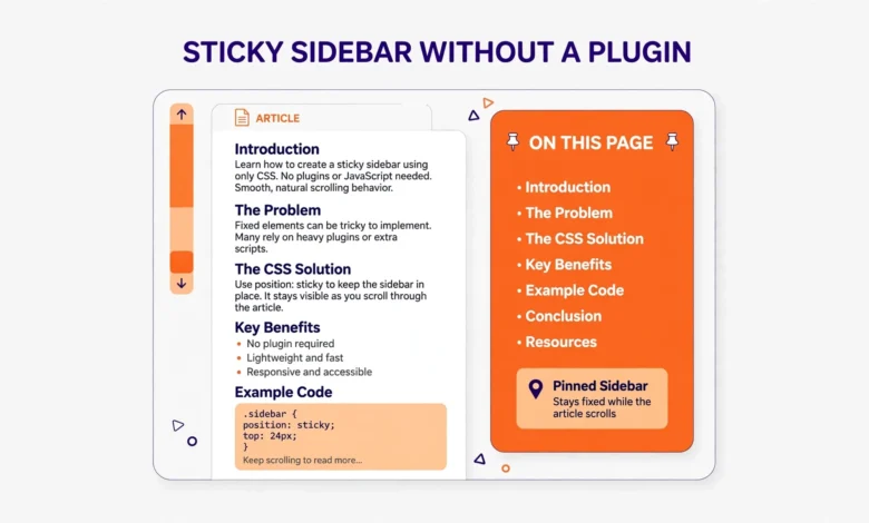
A sticky sidebar fixes this. It stays visible while the visitor scrolls, so your most important sidebar content remains on screen for the whole article. In this guide you will learn how to make a sticky sidebar in WordPress without a plugin, using a few lines of CSS, plus how to make only the last widget sticky, keep the effect on desktop only, and fix the common reasons sticky sidebars fail.
What Is a Sticky Sidebar in WordPress?
A sticky sidebar sticks to the top of the screen once you scroll past it, instead of scrolling away with the rest of the page. The content area keeps scrolling normally, while the sidebar stays put, usually with a small gap below the site header. When the visitor reaches the bottom of the page, the sidebar stops at the end of its container, so it never overlaps the footer.
Sticky sidebars suit content that deserves attention for the whole visit. A newsletter signup, a table of contents, a list of popular posts, or a small ad unit all perform better when they stay visible. They suit long sidebars less well, because a sticky sidebar taller than the screen cannot show all of its content, so keep the sticky part short and let the rest scroll away.
Plugins can add sticky sidebars, and they work fine, but a plugin is overkill for a job CSS can do in a few lines. Every plugin adds code to your site and another thing to update, so if you can paste a few lines into the Customizer, do it yourself and keep your site lighter. Keeping your site light matters for speed, as our guide to fixing a slow WordPress dashboard explains.
How Do You Make a Sticky Sidebar in WordPress Without a Plugin?
The method uses one CSS property, position: sticky, with a top value that leaves a gap below your header. With position: sticky, an element behaves normally until you scroll it to the top value you set, then it sticks there until its parent container ends. That is exactly what a sidebar needs, and it uses no JavaScript. Read the full reference for this property on MDN Web Docs for the technical details.
Go to Appearance, then Customize, then Additional CSS in your WordPress dashboard. This is where you add custom CSS that survives theme updates, unlike editing theme files directly. Paste in the code below, then publish. The selector below is a common one, but your theme may use a different class, so check your own theme, as covered in the next section.
.widget-area {
  position: sticky;
  top: 20px;
}
The top value sets how far below the top of the screen the sidebar stops. If your site has a sticky header, set top to the header height plus a small gap, for example 90px for a 70px header with 20px of breathing room. If your header is not sticky, 20px is a good starting point. Visit a blog post, scroll down slowly, and watch the sidebar. It should scroll with the page at first, then stop and stay in place.
How Do You Find the Right CSS Selector for Your Theme?
The selector is the part that changes between themes, and getting it wrong is the most common reason the code seems to do nothing. Your sidebar container may be called .widget-area, .sidebar, #secondary, or something theme specific. To find yours, open a blog post, right click on the sidebar, and choose Inspect. Look for the element that wraps all of your sidebar widgets, and copy its class or ID.
What Is the Selector in GeneratePress?
In GeneratePress, the sidebar widgets sit inside an element with the class .widget-area. This CSS makes the whole sidebar sticky with a 20px gap from the top of the screen. GeneratePress uses a clean layout with no extra wrapper that breaks sticky positioning, so the basic code usually works first try. If you use its sticky header, raise the top value to clear it.
.widget-area {
  position: sticky;
  top: 20px;
}
What Is the Selector in Astra?
In Astra, the sidebar uses the ID #secondary, and its widgets use the class .widget-area. Either selector can work, but #secondary is the most reliable because an ID is unique on the page. Use this code in Appearance, then Customize, then Additional CSS, and adjust the top value to clear your Astra header if it is sticky. With a different theme, the same inspection trick works: find the wrapper that holds every sidebar widget, copy its class or ID, and replace the selector in the code above.
#secondary {
  position: sticky;
  top: 20px;
}
How Do You Make Only the Last Widget Sticky?
Making the whole sidebar sticky is not always best. If your sidebar is long, with a search box, recent posts, categories, a tag cloud, and an ad, sticking all of it means the bottom widgets never appear, because the sidebar is taller than the visitor browser window. Better to let most widgets scroll away and make only the last widget sticky, so one useful item stays visible for the whole article.
To do this, target the last widget inside the sidebar instead of the sidebar itself. The CSS selector :last-child picks the final widget in the container. Add this code to Additional CSS with your theme sidebar selector, and the last widget will stick while everything above it scrolls away. Put your most valuable widget last, such as your newsletter signup or your most important call to action.
.widget-area .widget:last-child {
  position: sticky;
  top: 20px;
}
This trick has one condition: the last widget must be shorter than the browser window, or it cannot stick properly. A short newsletter box or small ad unit works well, while a tall widget will stick only partly and its bottom will stay out of reach. To make a different widget the sticky one, drag it to the bottom of the widget list under Appearance, then Widgets, and :last-child will pick it up automatically. Choosing what to keep visible is a content decision as much as a CSS one, and our WordPress internal linking strategy covers how to guide readers to your best posts from anywhere on the site.
How Do You Keep the Sticky Sidebar on Desktop Only?
Sticky sidebars are a desktop feature. On a phone, WordPress themes move the sidebar below the main content, so it appears after the article ends, not beside it. Making that stacked sidebar sticky would cover the content and ruin the reading experience, so limit the effect to desktop screens with a media query. A media query wraps your sticky CSS so it only applies when the screen is wide enough, and 1024px is a good cutoff that covers laptops and desktops while leaving tablets and phones untouched.
@media (min-width: 1024px) {
  .widget-area {
    position: sticky;
    top: 20px;
  }
}
If your theme switches to a single column layout at a different width, match the media query to that breakpoint instead, and test the result on a real phone as well as in the browser.
Why Is My Sticky Sidebar Not Working?
A sticky sidebar that refuses to stick is frustrating, but the cause is almost always one of a few CSS issues. Work through this list in order and test after each fix, because the first fix often solves it. The most common culprit is an ancestor element with overflow set to hidden, which silently disables sticky positioning for everything inside it.
- An ancestor has overflow hidden: if any parent element of the sidebar has overflow hidden, auto, or scroll, position sticky stops working. Check the layout wrappers in the Inspector and change that value.
- The sidebar is as tall as its parent: sticky needs room to move. If the sidebar fills its parent from top to bottom, there is nowhere for it to stick, so shorten the sidebar or lengthen the content.
- The parent uses flexbox with stretch: in some themes the sidebar parent stretches the sidebar to full height. Adding align-self: flex-start restores the room sticky needs.
- The top value is too large: if top is larger than the screen height, the sidebar never reaches its sticking point. Lower it to 20px and test again.
- The wrong selector is targeted: double check the class or ID in the Inspector, because a typo or a theme specific name means the CSS never applies.
The overflow hidden problem deserves a closer look, because it is the least obvious. Many themes set overflow hidden on a layout wrapper to contain floated elements or clip rounded corners, and the sidebar sits inside that wrapper. You cannot fix this with more sticky code, because the browser rule is absolute: sticky fails inside an overflow hidden ancestor. The fix is to change that ancestor overflow to visible, or move the sticky rule to an element outside the hidden wrapper, if your theme allows it. Test these fixes on a staging copy first, using our guide to building a WordPress staging site without a plugin, so a broken experiment never touches your live site.
What If You Would Rather Use a Plugin?
If CSS feels too fiddly, a plugin can add a sticky sidebar with no code at all. The free plugin Q2W3 Fixed Widget is the most popular choice: install it, go to Appearance, then Widgets, tick the Fixed Widget box on the widget you want to stick, and save. The trade off is another plugin to maintain, plus a little extra JavaScript on every page. For most sites the CSS method is cleaner and faster, and you now know how to fix it.
For more on keeping your site fast and tidy, read our WordPress SEO checklist for beginners and our web hosting guide. A sticky sidebar is a small change, but changes that keep visitors looking at your best content add up over hundreds of posts.
Frequently Asked Questions
Can I make a sticky sidebar in WordPress without a plugin?
Yes. Add position: sticky with a top value to your sidebar selector in Appearance, then Customize, then Additional CSS. The sidebar will stick once you scroll it to the top value, and it needs no JavaScript or plugin.
Why is my sticky sidebar not working in WordPress?
The most common cause is an ancestor element with overflow hidden, which disables sticky positioning. Other causes are a sidebar as tall as its parent, a wrong CSS selector, or a top value larger than the screen. Check each in order and test after every fix.
Should a sticky sidebar work on mobile?
No. On mobile your theme stacks the sidebar below the content, so a sticky sidebar would cover the article. Wrap your sticky CSS in a media query for screens 1024px and wider, so it only runs on desktop.
Is a sticky sidebar bad for page speed?
No, not when you use CSS. The position: sticky method adds only a few lines of CSS and no JavaScript, so it has no measurable effect on speed. A JavaScript plugin adds a small amount of weight, which is one more reason to prefer the CSS method.
Last updated: November 2026.