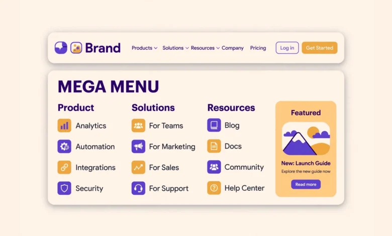
A mega menu is a large dropdown panel that opens when a visitor hovers over or clicks a top-level menu item. Instead of a narrow list of links, it shows several columns at once: categories, featured posts, images, and sometimes a short description or a call to action.
You do not need a plugin to build one. WordPress core menus, a little custom CSS, and the block editor can carry you most of the way, and the free version of Elementor covers the rest if you already use it. This guide shows three plugin-free methods, explains how to keep the menu usable on mobile, and ends with an honest note on when a plugin is actually the better choice.
What Is a Mega Menu and When Do You Need One?
A normal dropdown shows one column of links under a parent item. A mega menu shows a wide panel, often as wide as the page content area, divided into two to four columns. Each column usually has a heading and a group of related links, and the panel may also include an image, a featured post, or a search box. Visitors see your whole section at a glance instead of hunting through nested submenus.
You need a mega menu when your site has too many important pages for a simple dropdown. Online stores with many product categories, blogs with several topic areas, and business sites with services, resources, and support pages all fit this pattern.
- Your top-level items each have six or more subpages worth showing at once.
- Visitors need to compare sections side by side, such as product ranges or service types.
- You want to feature a popular post, a sale, or a new guide inside the menu itself.
- Your analytics show people opening the menu but struggling to find the right page.
Method 1: Core Menus Plus Custom CSS
This method uses the built-in WordPress menu system and a small amount of CSS. It works with almost any classic theme and needs no page builder: you build a normal nested menu, then use CSS to turn one dropdown into a wide multi-column grid.
Start in Appearance and then Menus. Create your menu structure with one parent item and its children underneath it. If you want column headings inside the panel, add custom links with a hash address such as # as the URL and use them as headings, with the real links nested below each one. Our guide on how to add a dropdown menu in WordPress covers the menu setup step by step if you have not built a nested menu before.
Next, give the parent item a CSS class so your styles target only that item. In the menu editor, open Screen Options at the top of the page and tick CSS Classes. A new field appears on every menu item. Add a class such as mega-menu to the parent item and save the menu. Our guide on how to add a custom CSS class to a WordPress menu item explains this screen in detail.
Now add the CSS. Go to Appearance and then Customize, open Additional CSS, and paste the code below. Adjust the width and the number of columns to fit your theme. The grid rule turns the dropdown into three columns, and the width rule stretches the panel wider than a normal dropdown.
.mega-menu .sub-menu {
    display: grid;
    grid-template-columns: repeat(3, 1fr);
    gap: 20px;
    width: 640px;
    padding: 20px;
    background: #ffffff;
}

.mega-menu .sub-menu li {
    list-style: none;
}

.mega-menu .sub-menu a {
    display: block;
    padding: 6px 0;
}
Preview the menu before publishing the CSS. Check that the panel opens on hover, that the columns line up, and that no link wraps awkwardly.
Method 2: Navigation Block in a Block Theme
If your site uses a block theme, the Navigation block gives you a more visual way to build a mega menu. Open the Site Editor, select the header template part, and click the Navigation block. Add a submenu to a top-level link, then add columns inside it using the block tools. You can place a heading block, a short paragraph, and a list of links in each column, which gives you far more layout control than the CSS method.
The strength of this method is that everything stays inside the editor: no code, no custom classes, and the result updates live as you edit. You can also add a paragraph with a short description under a column heading, or a button linking to a featured page.
Block themes handle the dropdown behaviour themselves, but the details vary between themes. Test the menu in the front end rather than trusting the editor preview. Check that the panel opens on hover for desktop visitors and on tap for touch screens, and that keyboard users can tab through the links in a sensible order. The official WordPress documentation on the block editor covers the Navigation block controls if you want to explore the settings further.
Method 3: Elementor Free Menu Widget Workaround
Elementor free does not include a dedicated mega menu widget, but you can still build one with the tools it does include. The trick is to build the panel as a section in your header template, then show and hide it with the menu link. Create a header template in Elementor Theme Builder, add a nav menu widget for the top-level links, and below it add a full-width section containing three or four columns of links, headings, and an image.
Set the panel section to hidden by default and use a hover or click interaction to reveal it when the visitor points at the matching menu item. Keep the panel visible on hover with CSS, and link the parent item to a landing page too, so touch users still reach the content. This workaround takes more fiddling than the other two methods, so use it only if Elementor already powers your site.
The payoff is visual freedom. You can add images, icons, short descriptions, and buttons inside the panel, and style every column to match your brand. The cost is weight: Elementor adds its own CSS and JavaScript to every page, so a menu built this way loads slower than the core menu method.
How Do You Handle Mobile Behaviour?
Mega menus are a desktop pattern. On a phone there is no hover, and a 640 pixel wide panel does not fit a 360 pixel screen. Every method in this guide needs a mobile plan, and the simplest good plan is to collapse the panel into a plain stacked list on small screens. A media query can switch the grid back to a single full-width column.
@media (max-width: 768px) {
    .mega-menu .sub-menu {
        display: block;
        width: 100%;
        padding: 10px 15px;
    }
}
Test the mobile menu on a real phone, not just a resized desktop browser. Tap the parent item and check that the panel opens, that every link is easy to tap without hitting its neighbour, and that the panel closes cleanly when you tap elsewhere. Do not try to preserve desktop columns on a phone: visitors will pinch, zoom, and leave.
Accessibility and Performance Tips
- Make the panel keyboard friendly: visitors using Tab and Enter must be able to open it, move through the links, and close it without a mouse.
- Keep link text descriptive. Short labels such as Services or Guides work in the top level, but links inside the panel should say what the page actually covers.
- Do not hide important pages only inside a mega menu. If a page matters, link it from the page content or footer as well.
- Limit images inside the panel to one small image. Large images in a menu slow down every page, including pages where nobody opens the menu.
- Keep the total link count modest. A panel with forty links is a sitemap, not a menu, and visitors will ignore most of it.
- The panel should announce itself as a submenu and read the links in column order.
Performance deserves a final word. A mega menu built with core menus and a few lines of CSS adds almost nothing to page weight. A mega menu built with a page builder and images adds real weight to every page load. The WordPress developer documentation on navigation menus explains the underlying menu functions if you want to extend the CSS method with your own code later.
When Is a Plugin Honestly the Better Choice?
Plugin-free methods cover most sites, but there are cases where a plugin saves real time. If you need different mega menus for different user roles, menus that change with the season, panels with product images pulled live from your store, or detailed click tracking per menu link, building all of that by hand is a project, not a quick task. A well maintained menu plugin gives you those features in an afternoon.
The rule is simple: if your menu needs logic or live data, use a plugin. If it needs layout only, the methods in this guide are enough.
Whichever route you pick, keep your menu code safe from theme updates. Custom CSS belongs in the Customizer or a child theme, never in the parent theme files. Our guide on how to create a WordPress child theme shows how to set one up in a few minutes, and it protects every customisation in this guide, not just the menu.
Frequently Asked Questions
Can I add a mega menu in WordPress without a plugin?
Yes. You can build one with core menus plus custom CSS, with the Navigation block in a block theme, or with the free version of Elementor. The CSS method is the lightest and works with almost any classic theme, while the block method gives you the most visual control without code.
How many columns should a mega menu have?
Three columns suit most sites, and four is the practical maximum. Two columns work well for small sites with few sections. More than four columns makes each column too narrow, forces link text to wrap, and overwhelms visitors. Start with three and add a fourth only when you have genuinely distinct groups to show.
Do mega menus hurt SEO?
No, a mega menu built with normal links helps SEO, because it gives search engines clear paths to your important pages. Problems appear only when the menu is built with JavaScript that hides links from crawlers, or when it links to dozens of thin pages. Keep the links in plain HTML, keep the count modest, and your menu supports your SEO instead of hurting it.
Why does my mega menu look broken on mobile?
Desktop mega menu CSS usually sets a fixed wide panel, which overflows a phone screen. Add a media query that switches the panel to a single full-width column below 768 pixels, as shown in this guide, and test on a real phone. If your theme replaces the menu with a hamburger panel on mobile, check that your custom CSS does not fight the theme rules inside that panel.
Last updated: November 2026.